Custom SwiftUI Layout
Have you ever tried to implement collection view with dynamic item sizes and dynamic item count per row in SwiftUI? Prior to iOS 16, you probably had to use GeometryReader to find out view sizes and positioning of subviews.
Starting iOS 16, new Layout protocol has been introduced that should be used to create custom layouts as it addresses some caveats of GeometryReader in specific cases.
I’d like to look into this new Layout and implement a custom component. But let me first ellaborate on that GeometryReader issue.
GeometryReader behaviour
GeometryReader was designed primarily to retrieve size information of container view and pass it down to subviews so they can scale accordingly. That means size information is transfered in one direction only and measurement has no effect on container view.
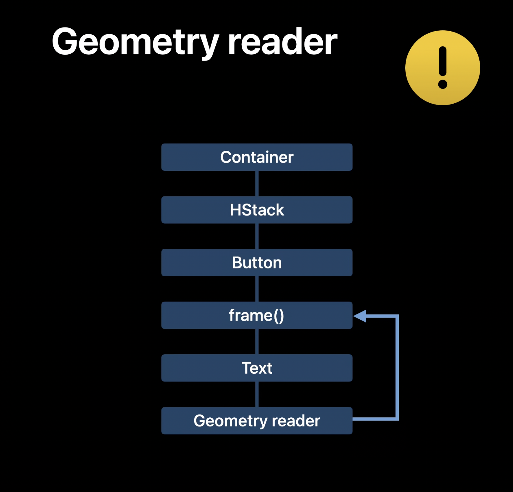
However, I’ve seen and used it also to measure a subview size and report that to container view (via PreferenceKey for example). That’s fine as long as it does not change container view size which might trigger another render loop. In this case GeometryReader bypasses SwiftUI layout engine and could result in rendering loop and app crash in the end.
 Example of GeometryReader bypassing SwiftUI layout engine. Figure taken from WWDC22 Compose custom layouts with SwiftUI video.
Assignment
Now that we know GeometryReader needs to be used with caution, let’s see what other option there is. For this example, we’ll be creating something I call Tag View. A component that lays out subviews of dynamic sizes horizontally and wraps them on new rows if they no longer fit. For simplicity, our subviews will be just Text views with some padding and background.
Here’s the code we could use to construct subviews. This computes powers of 10 ranging from 1 to 1 000 000 000 and showing that in Text with white font color and blue capsule background.
var subviews: some View {
    ForEach(0...9, id: \.self) { number in
        Text("Tag \(Int(pow(10, Double(number))))")
            .foregroundColor(Color.white)
            .padding(.horizontal, 6)
            .padding(.vertical, 3)
            .background(Color.blue)
            .clipShape(Capsule())
    }
}
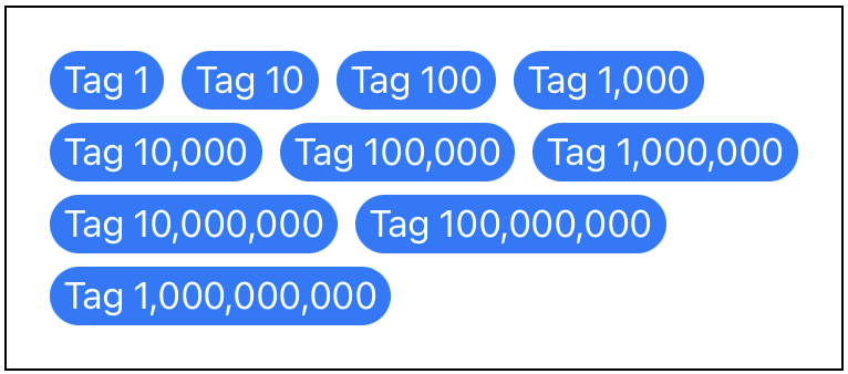
And this is the final component we should get at the end of this example, laying out texts generated from the code above.
 Tag View component layout example.
Data preparation
Before we get to Layout implementation, let’s prepare some code for later use.
At first, we’ll need to compute position and size of each individual subview. As this will be needed from multiple methods, I have extracted the computation to separate method. This method takes a new type Subviews as parameter, which essentially is a collection of proxies to subviews in our component. Method returns array of CGRect (containing top-leading position and size) matching the subviews order.
func computePositions(subviews: Subviews, maxWidth: CGFloat) -> [CGRect] {
    var maxHeight: Double = 0
    var currentPosition: CGPoint = .zero
    var result: [CGRect] = []

    for subview in subviews {
        let size = subview.sizeThatFits(.unspecified)
        if currentPosition.x > 0 {
            currentPosition.x += interitemSpacing
        }

        if currentPosition.x > 0, currentPosition.x + size.width > maxWidth {
            currentPosition.y = maxHeight + lineSpacing
            currentPosition.x = 0
        } else {
            maxHeight = max(maxHeight, currentPosition.y + size.height)
        }

        result.append(.init(origin: currentPosition, size: size))
        currentPosition.x += size.width
    }

    return result
}
Other method I prepared is an extension to CGRect to return new value with given origin offset. This is just for a convenience and will be needed when placing subviews at their final position.
extension CGRect {
    func offset(by point: CGPoint) -> CGRect {
        .init(origin: .init(x: origin.x + point.x, y: origin.y + point.y), size: size)
    }
}
We should be now all set to finally implement our custom layout component.
Layout
Layout is a new protocol introduced on iOS 16 to create custom layout components. Let’s first declare structure for our custom component as TagView, define configurable spacing values (for possible customization) and let it comply to Layout protocol.
struct TagView: Layout {
    let interitemSpacing: Double
    let lineSpacing: Double
}
If you try to compile the above, you’ll get a compilation error that this new type does not conform to Layout protocol. The reason is that there are two required methods that we have to implement.
First one is sizeThatFits(proposal:subviews:cache:) to compute our container component final size. It also introduces two new parameters.
- proposal (ProposedViewSize) - Size proposal from container view. This can tell you to use less, default or more space in size.
- cache - This parameter is associated type from Layout protocol. By default is of Void type and does nothing. You can define your custom data structure and pass it to both methods. However, official documentation says to “only implement a cache if profiling shows that it improves performance”.
We will first get positions and sizes for all subviews (using proposed component width by container) and then find maximum x/y value that basically defines width/height of our container.
func sizeThatFits(proposal: ProposedViewSize, subviews: Subviews, cache: inout Void) -> CGSize {
    computePositions(subviews: subviews, maxWidth: proposal.width ?? 0)
        .reduce(CGSize.zero, { size, value in CGSize(width: max(size.width, value.maxX), height: max(size.height, value.maxY)) })
}
Second required method to implement is placeSubviews(in:proposal:subviews:cache:) that should lay out subviews at their respective position. Here we get final component size and position as bounds parameter. After we get positions for all subviews (using final component width this time), we iterate over all subviews and set the position (offseted by container bounds position) using .place(at:anchor:proposal:) method on subview proxy.
func placeSubviews(in bounds: CGRect, proposal: ProposedViewSize, subviews: Subviews, cache: inout Void) {
    let positions = computePositions(subviews: subviews, maxWidth: bounds.width)

    for index in 0..<positions.count {
        guard subviews.indices.contains(index) else { continue }
        let finalPosition = positions[index].offset(by: bounds.origin)
        subviews[index].place(at: finalPosition.origin, anchor: .topLeading, proposal: .unspecified)
    }
}
Now when you put all pieces together, you should get the same result as we defined at the beginning using the following UI definition.
TagView(interitemSpacing: 8, lineSpacing: 6) {
    subviews
}
.padding(20)
.overlay(Rectangle().stroke(.black))
.frame(width: 400, height: 300)
Summary
Starting iOS 16 there is a new way of how to implement custom layouts that are not easily there using SwiftUI existing components. This was previously possible with use of GeometryReader, however that was not very optimal for SwiftUI layout system. Now there is new Layout protocol that should be a better option from now on.
Layout protocol has been first introduced on WWDC 22 in session Compose custom layouts with SwiftUI along with other new layout components you can check.
All code is available in the repository.
